×
Artist R.L. Gibson

Category: color theory

Wildhoney.

#honeyfromhornets

Inspired by the music, again, I couldn’t resist subtle rebellion of these #shoegaze wonders from Baltimore, Wildhoney, hence the hornet, not #honeybee. (continues below)

Wildhoney poster illustration by Artist R.L. Gibson!

Enjoy more illustrations from Artist R.L. Gibson!

<<<<<<<<<<<<<<<< >>>>>>>>>>>>>>>>>

Choices.

BECAUSE YOU ASKED..

So many of you have asked me about my preference in colored gesso.  I have pretty standard preferences in gel medium (Liquitex) and acrylic paint (Golden).  I find that an art supply is usually popular for a reason.  But occasionally, I find favorites by accident. (continues below)

First coat of gesso, Carmine by Holbein

I’ve spent years contemplating the addition of color and texture to my xerography, but all experiments have failed to impress.  Xerography, by my method, is tricky and inflexible.  Holbein to the rescue.  Lots of the big name manufacturers offer white, black & gray gesso.  But the 22 colors offered by Holbein make my heart sing (non-affiliate link). Did I mention that the packaging helps you squeeze out every last drop and makes mixing a dream? LOVE.  Carmine is my favorite.  I’ve added my first coats of gesso in prep for transfer…then paint.

Stay tuned…

PAINTING: Abstraction

Inspiration for Artist R.L. Gibson!the why & the what
OF PAINTING

I’ve been getting a lot of inquiries that all say something a little like: “Why add paint?” to xerography.  Why now? What is that going to look like?

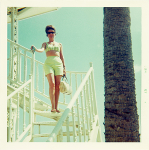
It is an evolution.  I’ve been working in black & white for SO LONG.  I love it.  I do.  I’ve always considered my work sort light-handed Pop Art, often with a dollop of Surrealism from my own photography.  But, when I appropriated family portraiture for the #DIKY series, it all began to unravel.  I have thousands of family photographs.  My family was prolific, but bizarrely enough, a lot of them don’t feel personal.  Honestly, they feel like my family posed as studies for the lifestyle advertising mock ups of the 1930s through the 1970s.  They are real people living glamorous lives without the benefit of money or extraordinary wealth.

They are just people truly LIVING.
They make me happy…
TECHNICOLOR happy.


Loads of saturated color will help me share a portrait of what life can be if you are paying attention.  Color will help me express what it feels like TO LIVE.  So in the meantime, I study color theory & the techniques of abstract expressionists.  Today’s happy place–LIVING.

Find your happy place. Go there.  And, go often.

Be sure to Follow Artist R.L. Gibson on Facebook!

  ⊕    ⊕    ⊕

PAPER indulgences…

BACK
to the books

As I prepare for my upcoming journey of adding color to my work–possibly on a semi-permanent basis, I have become excited by delving into color theory once again.  My eyes know the theory, but my brain has taken all for granted. So, I am allowing myself the ultimate indulgence of someone living a purposefully pared-down existence…art books–yum!

Deciding what NOT to purchase and/or borrow has been the hardest part. I’ll keep you updated on the books I love!  Today’s choice Confident Color: An Artist’s Guide To Harmony, Contrast And Unity by Nita Leland.  Today’s recovered art-i-fact from Confident Color: “Once in a while, you may want to go a little darker in value without overpowering that light feeling. [sic] Burnt Sienna turns any saturated paint color into an earth hue.”  Thanks, Nita! Burnt Sienna–today’s happy place.

Find your happy place. Go there.  And, go often.

Be sure to Follow Artist R.L. Gibson on Facebook!

  ⊕    ⊕    ⊕